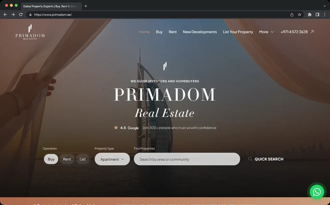
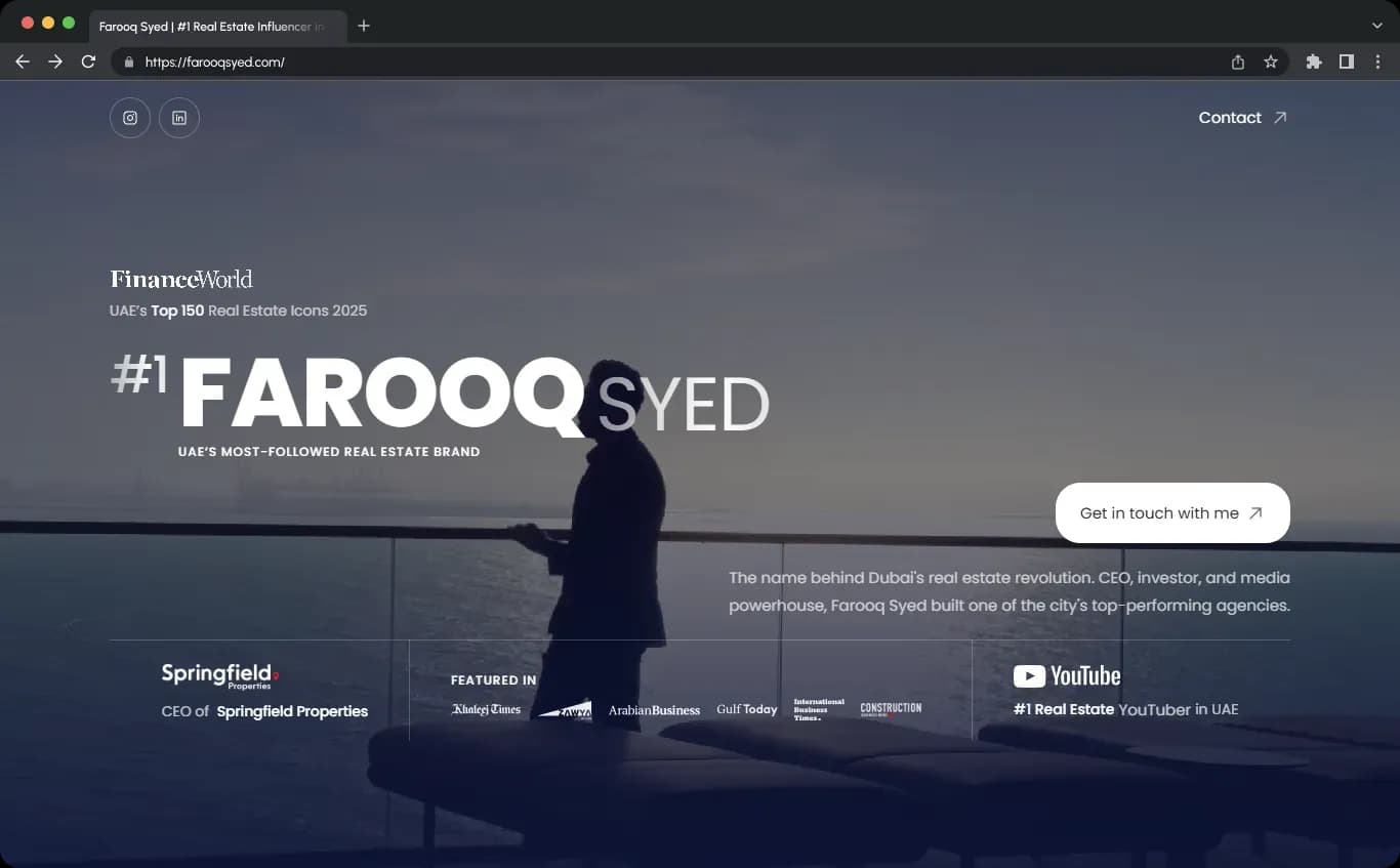
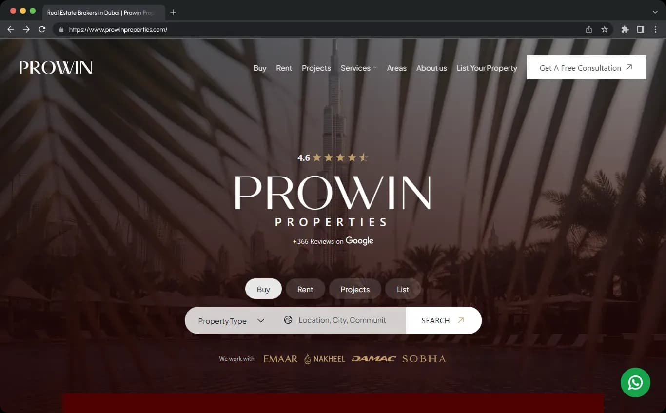
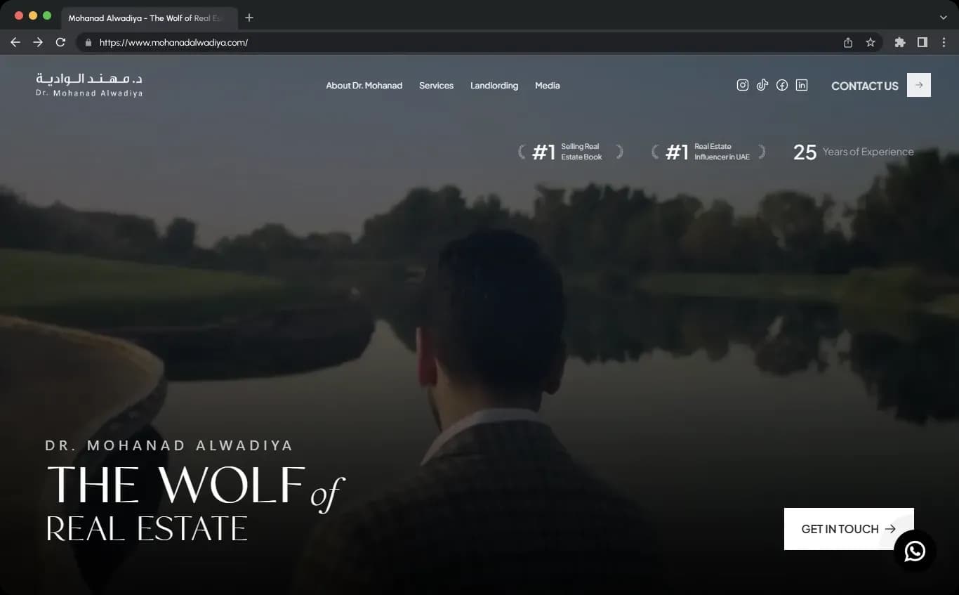
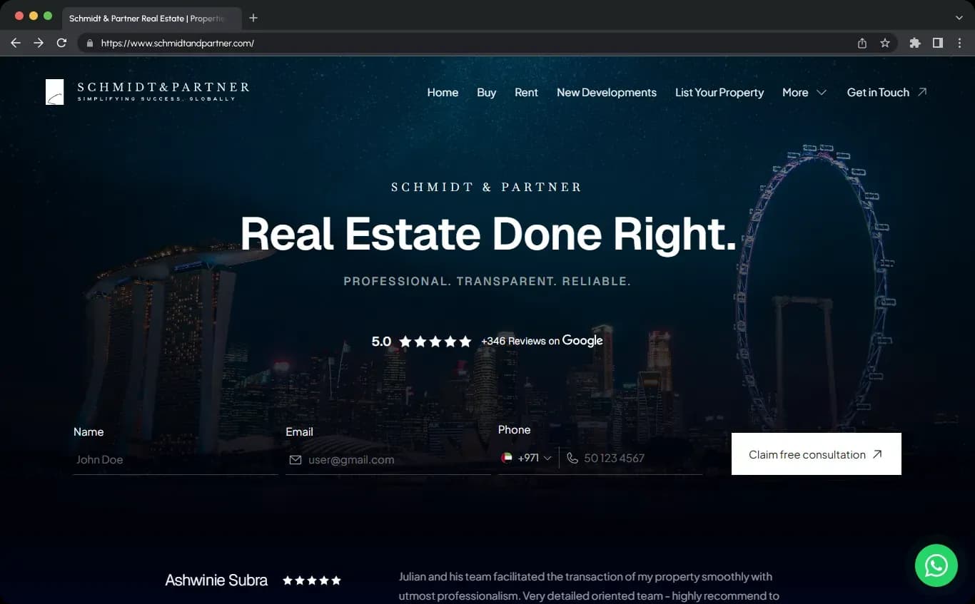
If you’re serious about real estate in 2026, your website is no longer a “nice-to-have.” It’s the core of your brand, the one digital asset you truly own, and the main place where buyers, sellers, tenants, and investors decide whether to trust you. Social media, portals, and ads all push people back to one destination: your real estate website.
In this 2026 edition, we’re not just going to list 24 pretty real estate site designs and say, “Look how nice this is.” We’ll show you the 24 best real estate website examples and, more importantly, the ideas, structures, and features you can steal from them—whether you’re building your own WordPress site, speccing out a custom build, or hiring a real estate web design agency.
We’ll connect the dots between what you see on award‑winning sites (Awwwards, Colorlib‑style lists, inMotion’s commercial gallery) and the new reality of 2024–2026: AI, IDX/MLS integrations, content marketing, and the shift toward high‑converting, search‑driven, mobile‑first experiences.
Why Real Estate Website Design Matters in 2026
The best real estate websites in 2026 aren’t digital brochures. They’re:
- Search tools that rival portals in speed and usability
- Lead-generation engines with built‑in funnels, CTAs, and AI chat
- Credibility platforms that show proof, expertise, and results
- Lifestyle magazines wrapped around hard property data
A few realities drive today’s standards for real estate web design:
- Almost everyone searches online first. Over 90% of buyers and tenants start on websites or apps before they ever talk to an agent. Your site is often the first—and sometimes only—place they evaluate your brand.
- User expectations are set by tech products. Visitors are used to map‑based search, saved favorites, instant filters, fast‑loading pages, and mobile‑first UI from apps like Airbnb and Zillow. A clunky realty website feels dated fast.
- Competition is brutal. In most markets, dozens of agents and agencies look interchangeable. Strong real estate website design—with sharp UX, compelling visuals, and clear messaging—is one of the few ways to stand out.
- Commercial tenants and investors expect sophistication. Institutional investors and corporate tenants judge credibility based on your digital presence, UI/UX, and how well you present your portfolio and data.
That’s why, across the 24 best real estate website examples below, we see a consistent pattern: they treat design, UX, content, and technology as strategic assets, not decorations.
What the Best Real Estate Websites Have in Common
Whether we’re looking at a small agent site, a luxury condo tower, or a commercial real estate owner-operator, the top-performing sites share these traits:
- Immediate path to action – Search bars, “Find a property” buttons, or “Book a tour” CTAs dominate the hero area. Visitors can start searching or inquiring in one click, without scrolling.
- Clean, uncluttered layouts – Generous white space, minimalist design, and clear hierarchies keep focus on listings, photography, and key actions instead of distractions.
- Powerful visual storytelling – Full-width photography, cinematic hero videos, image carousels, and subtle parallax or GSAP animations bring properties and neighborhoods to life.
- Modern interaction patterns – Masonry grids, card-based layouts, sticky headers, split‑screen layouts, and smooth scroll effects make exploration intuitive.
- Rich property exploration tools – Advanced search filters (location, price, features), map‑driven browsing, interactive maps, floor plans, virtual tours, and brochure downloads show depth, not just pretty pictures.
- Conversion-focused functionality – Lead forms, integrated booking calendars, “Schedule a consultation” CTAs on every page, newsletter opt‑ins, and, increasingly, AI chat assistants that capture and qualify leads.
- Trust and credibility elements – Testimonials, case studies, stats, media logos, Awwwards badges, and editorial content (market updates, neighborhood guides) signal that you’re an authority, not just another agent.
- Mobile-first performance – Responsive layouts, thumb‑friendly buttons, sticky call/search bars on mobile, and fast load times across devices.
- Solid tech stack – Well‑configured WordPress, Sitecore, Squarespace, or custom platforms with IDX/MLS integrations, CRM connections, and AI tools behind the scenes.
We see these same building blocks at work when we design a single‑agent authority site, an IDX powerhouse, or a team platform: fast search, clear structure, strong content, and conversion‑optimized UX.
24 Best Real Estate Website Examples in 2026
We’ve grouped the 24 best real estate website designs into three broad categories so you can quickly find inspiration that matches your own project:
- A. Residential & Mixed‑Use Property Websites – Buildings, communities, and developments
- B. Residential & Brokerage Brand Websites – Agents, teams, brokerages, and search platforms
- C. Commercial Real Estate & PropTech Websites – CRE owners, brokerages, and SaaS platforms
A. Residential & Mixed‑Use Property Websites
These sites typically promote a single building, community, or portfolio of properties. They’re great models if you’re launching a condo tower, new subdivision, or multifamily asset.
1. The Coloradan – Simple Luxury with a Masonry Grid
Type: Luxury residential building (Denver) – Squarespace
Best for inspiration: Minimalist real estate web design using a template
- Visuals & layout: The homepage uses a clean masonry grid layout of square photos. Each tile pairs high‑quality imagery with a short description, making the whole site feel like a curated gallery.
- UX & navigation: A straightforward top navigation keeps “Building,” “Residences,” and “Neighborhood” within easy reach. CTAs are clear and unfussy.
- Why it’s a top real estate website example: It proves you can build a stunning, high‑end property website on a platform like Squarespace if you invest in photography and pay attention to grid‑based layout, typography, and hierarchy.
2. City Sales – Search‑First Apartment Website
Type: Apartment specialist (Auckland) – Concrete CMS
Best for inspiration: Search‑driven apartment listing website
- Homepage strengths: The hero gives prominence to an advanced search and a hero slider that cycles through different campaigns or key listings.
- Design details: A sticky header with dropdown menus supports deeper navigation without feeling heavy. The design balances information density with clarity.
- What to copy: If you have a lot of inventory, build around a powerful search bar and 1–2 featured sliders rather than trying to show everything at once.
3. Tbilisi Gardens – Story‑Driven High‑Rise Site
Type: High‑rise residential project (Tbilisi) – Custom
Best for inspiration: Storytelling‑driven property website design
- Experience: Instead of dumping floor plans upfront, the site guides users through the building’s concept, safety, energy efficiency, and build quality. The narrative feels more like a product launch than a standard property listing site.
- Interface patterns: Minimalist pages, lots of whitespace, and an off‑canvas menu for navigation create a modern, app‑like feel.
- Takeaway: For single developments or new projects, focus on story and differentiation first, then layer in data, plans, and technical specs.
4. Akoya Boca West – Cinematic Condo Website
Type: Luxury condominiums (Boca Raton) – WordPress (Divi)
Best for inspiration: Cinematic, lifestyle‑driven luxury real estate site
- Design language: A full‑screen layout with high‑definition photography, hero video, and GSAP animations delivers an immersive experience without feeling gimmicky.
- Branding & feel: A vibrant, confident color palette and sticky header keep the site feeling polished and premium.
- What to emulate: Use video hero sections and subtle motion to sell lifestyle—especially if you’re in luxury real estate—while keeping navigation and CTAs front and center.
5. Rich Land Dubai – Minimalist UI with Deep Detail
Type: Modern real estate firm (Dubai) – Custom
Best for inspiration: Minimalist real estate website with advanced filters
- Homepage: A full‑screen hero with a smooth slider and prominent CTAs is complemented by GSAP‑enhanced scrolling that feels high‑end, not overdone.
- Search & exploration: Robust filtering lets visitors search by property type, neighborhood, and developer. Individual property pages showcase photos, floor plans, maps, and brochure downloads.
- Lesson: Keep your UI clean and use your listing pages for depth. Minimalist real estate web design doesn’t mean minimal information.
6. Icon Villas – Luxury Rental Website with Parallax
Type: Luxury private rentals (Cape Town & Africa) – WordPress
Best for inspiration: Vacation rental / villa website design
- Hero & content: A large, full‑width image slider showcases signature villas. An advanced property search encourages users to specify dates and preferences.
- Layout & effects: Warm grid layouts and layered parallax effects create a subtle sense of depth as you scroll.
- Apply this: For resort, vacation, or villa sites, combine big photography, straightforward booking‑style search, and gentle scroll animations to convey both trust and escape.
7. Mirabilis Apartments – Integrated Booking Engine
Type: Property management & serviced apartments – Sitecore
Best for inspiration: Apartment website with booking system
- Conversion focus: A video background hero sets the tone while a calendar‑driven booking widget turns the site into a direct reservation engine.
- Listing presentation: Apartments appear in a neat grid layout with concise summaries plus local context like nearby bakeries and shops.
- Key idea: If your properties are short‑stay or serviced units, integrate booking and availability tools directly—don’t send prospects off‑site.
8. Akershus Eiendom – Clean Commercial Listings
Type: Commercial real estate broker (Norway) – WordPress
Best for inspiration: Commercial property brokerage website
- Visual design: A full‑width layout, crisp typography, and disciplined white space keep complex property information accessible.
- Property tools: Vacant premises are presented via sliders and structured property cards with clear filters to narrow down the search.
- Copy this pattern: For commercial real estate websites, emphasize clarity, filters, and presentation of core data (size, use, location, availability) with clean UI.
9. Sanderson Weatherall – Surveyor Site with Video & Proof
Type: Commercial property surveyor (UK) – WordPress (Divi)
Best for inspiration: Professional service + CRE website
- Hero & structure: The hero uses an integrated video explaining the firm’s services, supported by an asymmetrical layout that adds visual interest.
- Conversion & proof: Appointment booking, case studies, and “success indicators” (stats, awards) are woven into the homepage.
- Takeaway: When your value is expertise more than listings, invest in explainer video, stats, and clear service paths.
10. The Net Seattle – Tech‑Forward Office Tower Site
Type: Office / mixed‑use tower – Custom
Best for inspiration: Mixed‑use or office development website
- Branding & aesthetics: Bold architecture photography and modern typography tell a story about innovation and sustainability.
- User experience: Key facts—location, amenities, specs—are easy to scan, while deeper pages provide more technical detail for brokers and tenants.
- How to use this: For office, mixed‑use, or tech‑centric projects, treat your building like a product: clear value propositions, features, and benefits.
11. 53W53 & 432 Park Avenue – Ultra‑Luxury Editorial Style
Type: Iconic ultra‑luxury residential towers (NYC) – Custom
Best for inspiration: Ultra‑luxury real estate website design
- Presentation: These sites use full‑bleed images, restrained color palettes, and editorial typography. Properties are framed like art pieces with galleries, floor plans, and long‑form copy.
- UX: Clear, linear journeys: view residences → select floor plan → request private viewing.
- Replicate if you’re in luxury: Focus on scarcity, craftsmanship, and lifestyle; keep navigation short and the design almost museum‑like.
12. The Yards DC & The Easton NYC – Neighborhood‑First Living
Type: Urban residential/mixed‑use developments – Custom
Best for inspiration: Neighborhood‑driven real estate site
- Design language: Youthful, energetic visuals showcasing waterfronts, parks, restaurants, and public spaces.
- Tools & content: Direct access to floor plans, amenities, local attractions, and virtual tours with clear leasing CTAs.
- Key lesson: When relocation and lifestyle drive decisions, your site should look more like a neighborhood guide than a static brochure.
B. Residential & Brokerage Brand Websites
These examples are perfect if you’re building a real estate agent website, team site, or brokerage platform that needs to generate leads, not just display a portfolio.
13. Property Club – Residential Search Platform
Type: Residential search platform (NYC)
Best for inspiration: Portal‑style real estate listing website
- UX focus: An advanced search bar in the hero paired with a bold image carousel keeps users engaged right away.
- Differentiation: The platform leans on transparency—direct access to landlords and brokers—and highlights media features for credibility.
- Apply it: If you’re building a mini‑portal or IDX powerhouse, make the hero all about search, and layer in proof that you’re more than just another site scraping listings.
14. Di Jones Real Estate – Boutique Meets Enterprise
Type: Residential agency (Australia) – Sitecore / PropertyBase
Best for inspiration: Boutique real estate agency website
- First impression: A clean hero with a search function invites users to “discover the best properties,” backed by minimalist design and smooth on‑scroll animations.
- Credibility: Stats, awards, and “success indicators” appear alongside a sleek contact section with Google Maps integration.
- Key idea: Marry a premium look with serious data and results; that’s what creates a boutique‑yet‑serious impression.
15. JSK Real Estate – Practical, Conversion‑Focused Agent Site
Type: Full‑service agency
Best for inspiration: Single‑city or regional brokerage site
- Homepage: A large advanced search block at the top, followed by recommended properties in card layout.
- Trust & support: Prominent testimonials and clear CTAs like “Find the property” guide visitors back into the search funnel.
- Takeaway: Don’t underestimate the impact of simple, familiar patterns (search + cards + testimonials) done cleanly—they convert.
16. Ripco Real Estate – Regional CRE Brokerage
Type: Commercial brokerage (NY, NJ, CT) – Custom
Best for inspiration: Regional brokerage website with deep inventory
- Hero & listing UX: The hero pairs advanced search with a concise brand intro. Featured listings rotate in a slider.
- Search shortcuts: Quick filters by place or property type help power users get straight to what they want.
- Copy this: Use side‑by‑side hero layouts (search + value prop) and quick filters if your inventory spans several regions.
17. RJ Investments – Dark‑Theme Investor Branding
Type: Investment & property management (UK) – WordPress
Best for inspiration: Investor‑focused real estate website
- Look & feel: A dark color scheme with asymmetric, overlapping sections creates a modern, financial‑grade aesthetic.
- Content structure: Emphasis on investment philosophy, strategy, and showcase projects rather than raw listings.
- Lesson: If your audience is investors rather than end‑users, design and copy should speak to returns, risk, and track record.
18. S&P (Super‑Prime Boutique) – Black & White Minimalism
Type: Super‑prime boutique real estate – WordPress
Best for inspiration: Luxury realtor website design
- Visual design: A black‑and‑white palette and parallax scrolling create a sense of sophistication and depth.
- Interaction: The logo sits centered with navigation branching left and right, reinforcing symmetry and brand focus.
- Borrow this: For ultra‑high‑end, minimal color and generous whitespace can say “expensive” more loudly than any gold gradient.
19. Jonathan Radford – Personal Brand with Full‑Screen Video
Type: Top‑producing luxury agent (New England) – Spark Platform
Best for inspiration: Single‑agent authority website
- Hero experience: A full‑screen video introduces Radford’s brand, properties, and persona, with options to watch a full résumé film, search properties, or call.
- Conversion paths: Visitors can immediately pick their journey: learn about the agent, start searching, or make contact.
- How this maps to our own builds: When we design agent authority sites, we take the same approach: hero video or strong hero promise, immediate search or “Book a consult” CTA, and credibility stacked early.
20. Compass – Tech‑Forward Brokerage UX
Type: National brokerage / tech platform
Best for inspiration: Tech‑driven real estate website with map search
- Core UX innovation: Map‑driven search with sleek filters, list + map views, and card-based listings gives the experience of a consumer app rather than a brochure site.
- Comprehensive content: Neighborhood guides, agent profiles, and property data are interwoven into a unified, responsive interface.
- Lesson: Even if you’re not Compass, prioritize fast, intuitive search and neighborhood‑level content to feel “tech‑forward.”
21. The Agency – Editorial Luxury Brokerage
Type: Global luxury brokerage
Best for inspiration: Editorial, cinematic luxury real estate site
- Brand & storytelling: Dramatic hero imagery and bold branding give each listing the feel of a magazine feature.
- UX: Simple navigation to markets, agents, and stories, while property pages are treated like editorial spreads with full‑width imagery and rich copy.
- Takeaway: For top‑tier luxury, invest in copywriting and layout that read like high‑end editorial, not just bullet‑point features.
22. Douglas Elliman – Search Plus Lifestyle Content
Type: Large luxury brokerage – US & international
Best for inspiration: Brokerage website blending listings and content
- Editorial approach: The site mixes listings with market reports, neighborhood guides, and design stories, turning it into a content hub.
- Search & navigation: Clean, powerful search UX and neighborhood‑driven navigation make exploring new cities intuitive.
- How we apply this pattern: In our own builds, when an agent or team wants to be “the” local expert, we model this approach: robust search plus a serious content library (market updates, neighborhood pages, relocation guides).
C. Commercial Real Estate & PropTech Websites
These examples influence how we approach commercial real estate web design—especially when sites must speak to investors, tenants, and partners.
23. Oxford, CBRE, Hines, RXR – Institutional CRE Benchmarks
Type: Institutional owners & global brokerages
Best for inspiration: Large‑portfolio commercial real estate websites
- Shared strengths: Pixel‑perfect design, strict brand alignment, and clear segmentation for audiences (Investors, Tenants, Clients, Partners).
- UX & navigation: Deep but intuitive site maps with clear entry points: Properties, Services, Investors, Insights, ESG.
- Takeaway: If you’re designing for institutional CRE, your site needs corporate‑grade design, strong information architecture, and a clear investor narrative.
24. Reonomy, Property Matrix, Biproxi, Yavica – SaaS‑Style CRE Tech
Type: CRE technology & property management platforms
Best for inspiration: Real estate SaaS / proptech website design
- Design approach: Bold typography, product screenshots, and clear value propositions (“Find off‑market deals,” “Automate your rent roll”).
- UX principles: Simple top‑level navigation, feature pages with scannable benefits, and conversion CTAs like “Book a demo” and “Start a trial.”
- Lesson: If you’re building real estate technology, adopt modern SaaS UX patterns: clarity, speed, and strong demo funnels.
Design Patterns & Features You Can Borrow
Across these best real estate website designs, we see repeatable patterns you can plug directly into your own build—whether you use WordPress (with a real estate theme like Houzez), Squarespace, or a custom stack.
1. Hero Area as a Decision Hub
- One primary action: Search bar (“Search all [MLS] listings”), “Find a property,” or “Book a tour.”
- One secondary action: “Get your home value,” “Download relocation guide,” or “View our portfolio.”
- Clear promise: A headline that states what you do and for whom (e.g., “Buying or selling in [City]? Search every home on the market & get hyper‑local advice.”).
2. Advanced Real Estate Search Done Right
- Filters that match user mental models: Buy/Rent, property type, neighborhood, price, bedrooms, and a “More filters” drawer.
- Map + list views for larger markets, with card‑based results.
- Saved searches and alerts when your IDX/MLS provider supports it.
3. Card‑Based Listing Layouts
- Each card shows a photo, price, location, basic specs (beds/baths/sqft or size/type).
- Hover or tap reveals quick‑view details or a “View details” CTA.
- Consistent card design across the site for a professional, cohesive look.
- Full‑width photography or video: Use hero videos or sliders for high‑impact properties, especially in luxury or mixed‑use developments.
- Storytelling + specs on property pages: Lead with a short narrative (“A quiet oasis in the heart of…”) followed by floor plans, feature lists, energy ratings, and downloadable brochures.
- Virtual tours & 3D: Embed Matterport or similar where possible for a “walkthrough” feel.
5. Subtle Motion, Not Gimmicks
- Use parallax scrolling, GSAP animations, and hover effects sparingly to guide attention.
- Avoid heavy animations that hurt performance or obscure CTAs.
6. Trust Builders & Social Proof
- Testimonials & reviews: Promote client quotes on your homepage and about page.
- Success indicators: Show stats (homes sold, transaction volume, occupancy rates), awards, Awwwards badges, and “Featured in” media logos.
- Education content: Market updates, neighborhood guides, and FAQs that answer the hard questions honestly—especially around affordability and timing.
- Contact forms that ask only what’s necessary (name, email, phone, goal/timeframe).
- Booking calendars for strategy calls or showings embedded directly into key pages.
- Persistent access to “Call,” “Email,” or “Book a tour” buttons, particularly on mobile.
8. Local Context & Neighborhood Content
- Dedicated neighborhood pages with honest pros/cons, median prices, commute times, and embedded, filtered listings.
- Neighborhood and relocation guides that double as blog posts and landing pages.
- Maps showing amenities, schools, and transit, not just property pins.
9. Mobile‑First Craftsmanship
- Layouts and search built for thumbs—large tap targets, sticky “Search” or “Call” bars, and easy filter toggles.
- Compressed images, optimized scripts, and caching for fast load times.
How to Apply These Examples to Your Own Website
Looking at great designs is useful, but we get the most value when we translate them into concrete structures. Here are a few real‑world patterns we lean on when building high‑converting real estate websites in 2026.
1. Build a Single‑Agent Authority Site
If you’re a solo agent or small team, model your site on the best single‑agent and boutique examples:
- Hero: Clear promise + search bar + your market (“Buying or selling in [City]? Search all listings & get straight‑talk advice.”).
- Authority stack: “Featured in” logos, stats like “220+ families helped since 2018,” and a short credibility blurb.
- Focused navigation: Buy, Sell, Neighborhoods, Market Updates, About, Contact.
- Content hub: Blog/resources answering specific questions people Google: “Cost of living in [City] in 2026,” “Best neighborhoods in [City] for families,” “Pros & cons of living in [City].”
We often implement this pattern on WordPress with a dedicated real estate theme (like Houzez or similar) plus IDX/MLS integration so your site can compete with portals in your niche.
2. Turn Your Site into an IDX Powerhouse
If your strategy is to capture search traffic and keep people off the big portals, model your site after Property Club or Compass:
- Map‑based search with half map / half list, plus robust filters.
- Account creation for saved searches and property alerts.
- Deep property pages with galleries, videos, virtual tours, floor plans, mortgage calculators, and “What’s nearby.”
On WordPress, we pair a strong real estate theme with IDX providers (RealTina, Realtyna, IDX Broker, etc.) to deliver this portal‑like experience in your local market.
3. Build a Neighborhood & Relocation Hub
For agents working with relocation clients or dominating specific farms, the best examples to study are Douglas Elliman, The Yards, The Easton, and any site with deep neighborhood pages:
- Create dedicated neighborhood pages with honest overviews, pros/cons, median prices, commute times, and embedded filtered listings.
- Publish relocation‑focused guides and video‑backed blog posts answering “Where should I live in [City]?” and “Best suburbs of [City] in 2026.”
These pages become long‑term SEO assets and landing pages for your YouTube and ad traffic.
4. Become the Market‑Update Authority
Borrow from the editorial strength of Douglas Elliman and the honest, macro‑meets‑local tone we see working from 2024–2026:
- Set up a market updates section with monthly posts and embedded video at the top.
- In each update, clearly state how prices, inventory, and affordability have changed—and what that means for buyers and sellers.
- End every update with relevant CTAs: “Get your home’s current sellable price,” “See all homes under $X in [Area].”
5. Layer AI into Your Real Estate Web Design
The best 2026 real estate websites feel smarter and more responsive because they quietly use AI behind the scenes and in the UI:
- Content: We use AI (ChatGPT/Claude/Gemini) to help outline and draft blog posts, guides, email sequences, and FAQs—then refine and localize them.
- Visuals: AI‑assisted virtual staging, decluttering, and improved imagery (within compliance) for listing photos and blog graphics.
- On‑site chat: Real estate–focused AI assistants that answer buyer/seller questions, collect lead data, and integrate with your CRM.
- Presentations: AI‑generated buyer and seller presentations that you can send after someone fills out a form.
From the visitor’s perspective, your site just feels faster, more helpful, and more personalized.
The Tech Stack Behind Top Real Estate Website Designs in 2026
Most of the high‑performing sites we study and build share a similar backbone, even if the designs look very different.
- Platform: WordPress dominates for customizable real estate sites, followed by Sitecore for enterprise and Squarespace for simpler brochure‑style projects.
- Theme / base design: Real estate–specific themes (e.g., Houzez or similar) that provide property post types, agent profiles, advanced search widgets, and map integration out of the box.
- Page builder: Elementor or a similar drag‑and‑drop builder for flexible, responsive layouts.
- IDX/MLS integration: Providers like RealTina, Realtyna, IDX Broker, or native integrations tied into property post types and search.
- Performance & SEO: Solid hosting (Hostinger, SiteGround, WPX, etc.), SSL, caching, image optimization, and SEO plugins like Yoast or RankMath.
- AI & automation: AI writing tools, image tools, chat assistants, and voice agents handling FAQs, follow‑up, and missed calls.
A Blueprint for a Best‑in‑Class Real Estate Website in 2026
To wrap things up, here’s a concrete website structure that combines the strongest ideas from the 24 best real estate website examples:
- Homepage: Hero with promise + IDX search; authority strip with stats and logos; three main CTAs (Buy, Sell, Relocation); featured neighborhoods; latest market update; recent blog posts; simple email opt‑in.
- Navigation: Buy, Sell, Neighborhoods, Market Updates, Resources, About, Contact.
- Buy page: Step‑by‑step process, FAQs, pre‑approval partner link, curated searches.
- Sell page: Pricing and prep process, honest guidance about timing and affordability, “Get your home’s value” form.
- Neighborhoods section: Index page plus individual neighborhood pages with pros/cons, prices, videos, and filtered listings.
- Market updates: Monthly posts and videos with clear “what it means for you” guidance.
- Resources / blog: Organized library of relocation guides, buying/selling/investing content, each with embedded videos and relevant CTAs.
- About: Story, philosophy, team bios (if applicable), testimonials, and results.
- Contact: Simple form, phone, email, address/map, and embedded booking calendar.
- Back end: CRM integration, analytics, and, for teams, agent dashboards tied to listings and leads.
If you align your structure and functionality with these patterns and borrow the best visual and UX cues from the 24 examples above, you’ll be very close to a best‑in‑class real estate website design for 2026—one that doesn’t just look impressive, but actually generates leads, builds authority, and works as the central hub of your business.