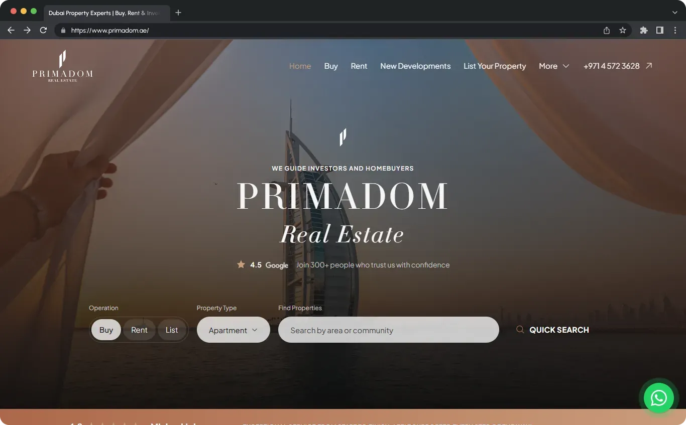
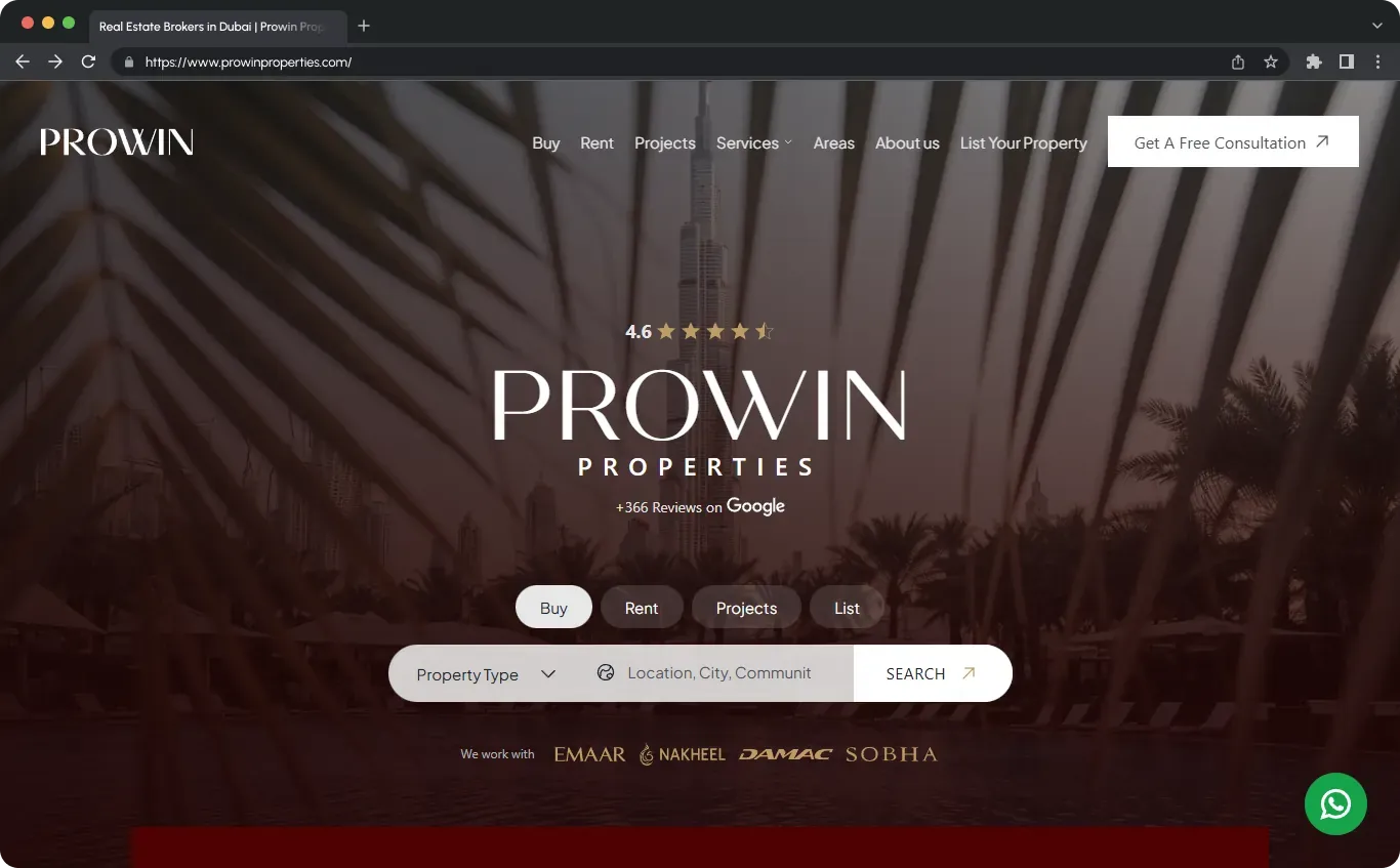
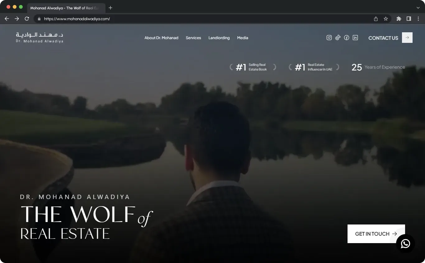
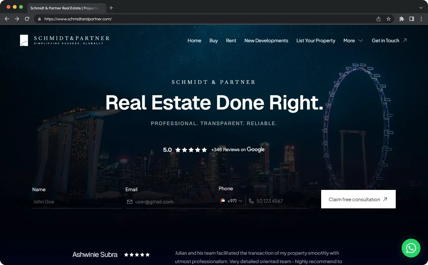
When we talk about real estate logos, we’re really talking about the curb appeal of your entire business. Before someone reads a testimonial, clicks your listing, or walks into an open house, they see a tiny brand mark on a yard sign, a website, or a social profile. That real estate logo quietly tells them if we look established or amateur, luxury or budget, modern or dated.
In this guide, we’ll walk through everything you need to know about real estate logos: what they need to do, the most effective logo styles for agents and brokerages, how to use templates and logo makers without looking generic, and how to end up with a professional, flexible real estate brand identity you can actually use everywhere.
What a Real Estate Logo Really Needs to Do
A real estate logo is not decoration; it’s a working asset. Think of it like your dating-app profile photo for your business: people “swipe” on your brand based on that symbol long before they meet you.
A strong real estate logo should:
- Clarify what you do – At a glance, people should understand that we’re in real estate: residential, commercial, luxury, property management, development, or investments. Even when we lean on minimal monograms instead of houses and roofs, the supporting words like “Real Estate,” “Properties,” or “Investments” must make it obvious.
- Differentiates you from competitors – Browse any gallery of real estate logos on Freepik, Canva, Pinterest, or Adobe Stock and you’ll see the same house-roof-swoosh over and over. Our logo has to cut through that noise instead of blending into it.
- Expresses positioning & personality – The mark should hint at whether we’re luxury or budget-friendly, corporate or boutique, tech-driven or traditional, investor-focused or community-focused. A minimalist monogram in black and gold feels very different from a script logo in bright colors.
- Work in every size and format – Real estate logos live on yard signs viewed from a car, listing websites, social media avatars, business cards, brochures, email signatures, vehicle wraps, and open house signs. If we can’t read it from across the street or inside a tiny profile circle, it’s not doing its job.
- Stay flexible as we grow – Our property logo should still make sense if we expand into different neighborhoods, add a team, open a brokerage, or move into investments and development. A timeless real estate brand mark saves us from rebranding every few years.
Popular Real Estate Logo Styles (and What They Signal)
When we scroll through thousands of real estate logos on stock and template platforms, clear patterns emerge. We can use those patterns intentionally instead of grabbing the first roof icon we see.
Common Real Estate Logo Icon Themes
- Houses & roofs – Simplified houses, rooflines, windows, chimneys. These icons scream “home” and are perfect for residential real estate logos and home logos. The advantage is instant clarity; the downside is that basic house logos are the most overused realty logo concept on the planet.
- Skylines & buildings – Great for commercial real estate logos, developers, and city-focused brokerages. Mixed-use silhouettes (houses plus towers) can communicate that we cover both residential and commercial property. We just have to keep details minimal so the building logos don’t turn to mush at small sizes.
- Keys, doors & locks – Keys and doorways show access, security, and opportunity. They work well for property investment logos or real estate agency logos that emphasize “unlocking” homeownership or wealth. Because key logos are also common, the trick is to combine them with a distinctive monogram or unique composition.
- Maps, pins & compasses – These icons emphasize local expertise and guidance. A map pin over a house, or a subtle compass in a letterform, can be strong for localized branding (for example, “Austin Property Group” with a Texas outline). We just have to be careful not to drift into travel or generic tech logo territory.
- Monograms & initials – Using initials like “AB” or “RE” as the core symbol is one of the most effective directions for modern real estate logos. Minimalist realty monograms feel premium, translate well across platforms, and are ideal for personal agent logos and real estate team logos. On their own, they might not scream “property,” so we pair them with wording like “Real Estate Group” or “Property Management.”
- Abstract & geometric marks – Lines and shapes that hint at buildings, plots, or movement without being literal. This style works well for luxury real estate logos, commercial realty logos, and real estate investment company logos that want a sophisticated, corporate feel.
Typography Choices in Real Estate Logos
Typography is where many real estate business logos succeed or fail. The same house icon can look premium or cheap depending on the font.
- Sans-serif fonts – Clean, modern and common in tech-forward property logos, property management logos, and contemporary agencies. Think Compass-style modern real estate branding.
- Serif fonts – Classic, stable, and often used in luxury real estate logos, heritage brokerages, or high-end commercial real estate firm logos. A refined serif can make a simple wordmark feel like a premium realty logo.
- Script & hand-lettered fonts – Great for adding a personal, boutique feel, especially in solo realtor logos targeting families or local communities. We keep scripts for short names or accent text so the brand name remains easy to read on signs.
Color Palettes for Real Estate Branding
Color choices in real estate logos telegraph a lot about how we work and who we serve.
- Blue & white – The default for “professional, trustworthy” real estate branding logos. Works for everything from residential realty logos to commercial property logos, but we need strong typography or a distinctive logo icon to stand out.
- Black, white & gray – Minimal, premium palettes used heavily in modern and luxury realtor logos. Black-on-white wordmarks are also incredibly flexible across digital and print.
- Gold & metallics – High-end luxury, especially when paired with black, deep navy, or forest green. In practice we usually design a flat gold color that prints cleanly, then apply metallic treatments (like foil) where budgets allow.
- Green – Associated with land, growth, investments, and eco-conscious properties. Ideal for development logos, land & farm property logos, or real estate investment logos.
- Red & orange – Eye-catching and energetic, good for aggressive sales teams and highly visible yard signs. We use them carefully because they can feel harsh if overdone.
- Neutrals (sand, taupe, beige) – Warm and inviting, perfect for home-focused property brand identities targeting families and lifestyle-led buyers.
Matching Your Real Estate Logo to Your Niche
Real estate is broad. A logo that works for a boutique luxury brokerage may be totally wrong for a property management firm. We design real estate logos by starting with the niche and ideal client.
Residential Agents & Team Logos
Residential real estate logos usually need to feel warm, trustworthy, and easy to read from across the street. We often lean on combination marks that pair a simple house logo or monogram with a clean wordmark like “Smith Realty Group.” Color-wise, a modern real estate logo for a residential team might combine navy, white, and a soft accent color to feel both established and friendly.
Luxury Real Estate Logos
Luxury real estate company logos and luxury realtor logos tend to strip away obvious icons altogether. Instead of rooflines, we use monograms, refined serif typefaces, generous spacing, and a limited palette—often black, white, and metallic gold or champagne. A luxury real estate logo design might just be initials inside a subtle circle or square, used consistently across high-end brochures, listing presentations, and elegant property signage.
Commercial & Investment Real Estate Logos
Commercial real estate logos, REIT logos, and real estate investment firm logos often emphasize authority, analysis, and scale. Abstract building logos, city skylines, or geometric icons paired with strong sans-serif or slab-serif typefaces tend to work well. Colors skew darker and more corporate: deep blue, charcoal, dark green, occasionally accented with a bold highlight color.
Property Management & Rental Property Logos
Property management logos, apartment rental logos, and HOA management logos need to communicate reliability and clarity. A lot of the time, the best property logo is almost boring—in a good way. Clean sans-serif fonts, simple building or home logos, and accessible colors like blue and green are usually enough when we focus on legibility and consistency across invoices, portals, yard signs, and door hangers.
Developer & Builder Logos
Developer and construction & real estate logos are where more architectural, geometric design shines. These property developer logos often feature bold shapes, abstract building silhouettes, and custom typography inspired by architectural lines. Earth tones, deep blues, and concrete-like neutrals give off a sense of durability and craft.
Principles of Strong Real Estate Logo Design
Regardless of niche, the best real estate logo designs share a set of practical qualities.
- Simplicity – The more details, gradients, flourishes, and tiny windows we add, the more likely the logo is to fail on a business card or mobile screen. Simple property logos are more versatile and more memorable.
- Memorability – A single clear idea—a monogram, a cleverly integrated roofline, a subtle compass, or a unique house brand mark—sticks far better than a collage of a house, key, skyline, and handshake all at once.
- Versatility – A modern real estate logo must work in full color, black and white, on light and dark backgrounds, horizontally and in stacked form, as a square icon and as a long header. We always test logo layouts in all of these contexts before locking them in.
- Appropriateness – The tone must match the audience. A playful realtor logo with bright colors and script fonts might be perfect for first-time buyer specialists and totally wrong for a commercial investment group.
- Timelessness – We’ve all seen old property logos with dated swooshes, clip-art roofs, or heavy 3D gradients. They age quickly. By focusing on clean shapes and classic typography, we keep our real estate branding logo relevant for years.
Planning Your Real Estate Logo Before You Design
Most agents and teams skip straight to “Which template looks nice?” We get much better logos when we slow down and write a quick brand brief first.
Clarify Your Brand in Writing
Before choosing any real estate logo template or firing up a logo maker, we like to write answers to a few questions:
- Who’s our primary audience (first-time buyers, luxury sellers, investors, relocators, landlords)?
- What city, region, or territory do we focus on?
- Are we building a personal realtor logo or a real estate company logo that might grow into a team?
- Which three words should our brand feel like (for example: “calm, strategic, discreet” or “friendly, energetic, tech-savvy”)?
- Do we want to emphasize a personal name, initials, or a descriptive brand name?
Choose a Logo Type
For most real estate logos, one of these structures works best:
- Wordmark – Just the name in a distinct typeface, like “Oak & Stone Properties.” Great if the name is short and strong.
- Lettermark / Monogram – Initials or acronym (e.g., “JG” or “NRG”). Ideal for personal brand realtor logos and luxury realty logos.
- Combination mark – Icon plus logotype. This is the classic real estate logo design: a house or skyline icon paired with “Smith Real Estate Group.”
- Emblem – Text within a badge, seal, or crest. Visually powerful for property group logos and boutique brokerage logos, but slightly less flexible than a combination mark.
Sketch a Concept (Paper or Screen)
We don’t need to be artists. Rough thumbnails help us answer:
- Does the icon sit above, beside, or inside the text?
- Are we stacking the words (e.g., “Smith” on top, “Real Estate Group” underneath), or keeping them on one line?
- Can any letters double as simple real estate symbols (like an “A” forming a roof)?
Using Real Estate Logo Templates, Logo Makers & Stock Assets
Most agents aren’t going to open Adobe Illustrator and design a property logo from scratch. That’s why platforms like Canva, Freepik, Adobe Stock, Pinterest boards, and online logo makers are full of real estate logo designs, vectors, and templates. We can absolutely use them—if we’re smart.
Real Estate Logo Templates (Canva, Etsy, etc.)
Real estate logo templates are a quick way to get professional layouts. We browse “real estate logos” or “realtor logo templates” and then customize:
- Fonts – Swapping the default typeface for a better-matched family (e.g., a sharper serif for luxury, or a softer sans-serif for family-focused property branding).
- Colors – Replacing generic blue/gold with our actual brand palette.
- Layout – Adjusting spacing, scale, and placement so our name fits comfortably.
- Icons – Replacing an overused house icon with a cleaner property symbol or a custom monogram.
The key is that a real estate logo template is a starting point, not the finish line. We don’t want our realty logo to be identical to dozens of other agents in our MLS.
Stock Vectors & Real Estate Logo Icons
Sites like Freepik and Adobe Stock are full of “real estate logo vector” collections. We can license icons and layouts legally and then edit them in a vector tool:
- Combining multiple stock elements into one unique home logo or property logo.
- Simplifying complex building icons for clarity.
- Integrating initials into a stock roof or key icon for a semi-custom brand mark.
It’s important to remember that off-the-shelf real estate company logos from stock sites are usually not trademarkable as-is. For a protectable realty brand logo, we either heavily modify stock or commission a custom design.
Logo Makers & Generators for Real Estate Logos
Online logo makers (including AI-driven tools) can generate quick realtor logos with a name, industry, and a few style choices. They’re fine for early-stage agents, but we treat the outputs as drafts that we refine:
- We pick the strongest layout and then upgrade fonts and colors in a design tool.
- We simplify overcomplicated icons and remove unnecessary effects like heavy gradients or shadows.
- We create alternate versions specifically tailored to how we’ll actually use the logo (signage, digital, print).
Designing Your Real Estate Logo Step by Step
To keep the process manageable, we like to follow a concrete sequence rather than bouncing randomly between templates.
1. Choose a Font Strategy
We typically pick one primary font and one supporting font for descriptors like “Real Estate,” “Properties,” or “Group.”
- Corporate or commercial – A strong sans-serif or modern serif in all caps feels authoritative for commercial real estate logos and investor-focused property logos.
- Luxury – A high-contrast serif for the main name (e.g., “The Windsor Group”) paired with a minimalist sans-serif for “Real Estate” delivers a premium feel.
- Local & personal – A friendly serif or rounded sans-serif works well for neighborhood agent logos and family-focused branding. If we use a script, we keep it short and legible.
2. Pick a Color Palette
We decide on:
- One dominant brand color (e.g., deep navy, forest green, charcoal).
- At least one neutral (white, off-white, light gray, black).
- Optional accent color (gold, rust, soft blue, terracotta).
Then we test the real estate logo in:
- Full color on white.
- Full color on a dark background.
- Black-only and white-only.
If our realty logo still works in solid black or solid white, we know we’ve kept it simple enough.
3. Design or Choose the Icon
For icon-based real estate logos, we keep three rules in mind:
- Limit details – No tiny windows, text inside shapes, or delicate lines that will vanish on small screens.
- Communicate real estate, but not in a cliché way – We can still use house logos or building logos, but we look for fresh angles: negative space, monogram integration, or stylized plots of land instead of generic clip-art.
- Check scalability – We zoom out until the icon is the size of a social media avatar. If we can’t see what it is, we refine it.
4. Layout & Hierarchy
Next, we decide what people should see first. Usually, that’s the brand name, not the generic words “Real Estate” or “Properties.” For a typical real estate company logo, we might:
- Place the icon to the left, with the brand name in bold and the descriptor below in smaller text.
- Use a stacked version with the icon above for square spaces like Instagram and signage toppers.
- Ensure plenty of breathing room around the logo so it doesn’t look cramped.
5. Create Logo Variants for Real-World Use
Instead of only one layout, we build a small system of real estate logos so we’re covered everywhere:
- Primary logo – Full real estate company logo with icon and name in horizontal format.
- Secondary or stacked logo – Icon above text, ideal for square or vertical placements.
- Submark or icon-only – Just the monogram or symbol for social media icons, favicons, and small spaces.
- One-color versions – Solid black and solid white versions for maximum reliability.
Common Mistakes in Real Estate Logos (and How We Avoid Them)
We see the same pitfalls in real estate brand logos over and over. Knowing them in advance makes it easier to sidestep them.
- Overcrowded designs – Logos that try to show a house, skyline, key, handshake, and full tagline all at once end up unreadable, especially on small screens or yard signs.
- Copy-paste stock logos – Barely customized stock real estate logos can look generic and can’t usually be trademarked as unique. We always modify or build on them meaningfully.
- Overly trendy effects – Heavy gradients, metallic 3D effects, drop shadows, and glow styles that look impressive on-screen can print badly and age quickly.
- Poor contrast – Light gray text on white or dark blue on black may look subtle on a monitor but will disappear in real-world contexts. Real estate signage, in particular, demands high contrast.
- Illegible fonts – Ultra-thin fonts, dense scripts, and decorative display fonts often fail when scaled down. If we can’t read the agent’s name at a glance, the logo is failing.
DIY vs. Hiring a Designer for Your Real Estate Brand Logo
There’s no single “right” way to get a real estate logo. It depends on budget, goals, and how unique we need the brand to be.
When DIY Real Estate Logos Make Sense
Designing a real estate logo yourself using Canva, logo makers, or AI plus a template is usually fine when:
- We’re just starting out as an agent or small team.
- Our budget is limited and we’d rather invest in leads, photography, or coaching first.
- We’re comfortable with a simpler, semi-generic real estate logo that still looks clean and consistent.
We can still treat DIY seriously: choose a clear direction, customize carefully, and build a small identity system instead of relying on a single PNG.
When to Hire a Professional Logo Designer
Hiring a professional to create a custom real estate branding logo is worth considering when:
- We’re building a real estate brokerage, property group, or investment company with long-term ambitions.
- We want a real estate brand identity that stands apart in a crowded luxury or metropolitan market.
- We need a mark we can confidently protect, trademark, and build a full visual system around (signage, print collateral, digital assets).
A good designer will translate our story, niche, and goals into a visual language: real estate logo design, color systems, typography guidelines, and usage rules that keep everything cohesive over time.
Brokerage Compliance & Co-Branding Your Real Estate Logo
If we’re with a national brokerage or franchise (e.g., eXp, Keller Williams, RE/MAX, Coldwell Banker), we typically can use our own real estate logo as long as we meet branding and legal guidelines.
Most brokerage and board rules require:
- Displaying the brokerage name and/or logo alongside our personal brand logo.
- Maintaining a minimum size or relative prominence for the brokerage mark.
- Keeping certain colors or lockup formats intact for the brokerage logo.
A practical way to solve this is to create a “combined” layout in our design tool:
- Our personal realtor logo or real estate team logo on one side.
- A dividing line or spacing.
- The brokerage logo on the other side, sized according to the rules.
We save this co-branded lockup in both light and dark versions so it’s easy to drop into yard signs, brochures, email signatures, and social graphics without reinventing the wheel each time.
Testing Your Real Estate Logo in Real Life
Before we finalize any real estate logo design, we run it through a few simple tests that mimic real-world use.
- Tiny digital sizes – We shrink the logo down to the size of a website favicon and a social media profile image. Can we still recognize the icon and read the name?
- Small print – We place the logo in a business card mockup, postcard corner, and email signature. Is the type still legible, and does the icon hold up?
- Large formats – We mock up the real estate sign logo on a yard sign and open house sign. Does the brand feel as strong from across the street as it does close-up?
Where the logo fails, we simplify. Removing tiny details and slightly increasing font weight often makes a huge difference.
Essential Files & Formats for Real Estate Logos
Whether we DIY or hire a designer, we want to walk away with more than a single JPEG. A complete real estate branding package should include:
- Vector files – AI, EPS, or SVG files that scale indefinitely. Printers, sign shops, and designers rely on these.
- Transparent PNGs – In color, black, and white, for websites, overlays, and social graphics.
- Horizontal & stacked versions – So we can adapt the logo to different layouts and spaces.
- Square or circular submark – Ideal for Instagram, Facebook, LinkedIn, and favicons.
- Basic style guide – Simple guidelines for logo usage, spacing, minimum size, and official colors (HEX, RGB, and CMYK values), plus the names of our brand fonts.
Optimizing Real Estate Logos for Online Discovery & Branding
While the logo itself is visual, the way we name, describe, and share it online affects visibility and consistency across the web.
- Consistent naming – We use the same real estate business name and wording everywhere—website, Google Business Profile, social media, email signature—so the brand is easily recognized.
- File naming & alt text – When we upload our real estate logo PNG to a website, we name it something meaningful like smith-real-estate-logo.png and use alt text such as “Smith Real Estate Group logo” for accessibility and clarity.
- Brand kit usage – We store our real estate logo files and brand colors in a central toolkit (for example, a Canva Brand Kit or shared folder) so every piece of marketing—from listing presentations to Instagram Reels covers—uses the same identity.
Bringing It All Together for a Strong Real Estate Brand Mark
A polished real estate logo won’t close a deal on its own, but it sets the tone for every interaction buyers, sellers, investors, and partners have with us. When we anchor our property logo in a clear brand strategy, choose the right style for our niche, keep the design simple and flexible, and organize our logo assets for easy use, we end up with a real estate brand identity that actually supports the business we’re building.
Instead of just grabbing the first house icon we find, we can treat our real estate logo as the foundation for everything else: signs, social graphics, listing presentations, buyer and seller guides, and even team culture. Done thoughtfully, that little mark becomes the symbol clients associate with great experiences—long after they’ve moved into their new home or closed on their latest property investment.
